Menu Engineering: The Design Decisions That Change What People Order



Menu engineering is the practice of analysing every dish by how popular it is and how much profit it contributes, then using design to steer attention toward the items that earn the most. It is half accounting and half graphic design, and most restaurants only ever do the accounting half.
That second half is where this guide spends most of its time, because it is the part that gets asserted confidently and tested rarely. Some of the menu design advice that circulates as settled fact has been tested and failed. Some of it has been tested and holds up well. This guide separates the two and cites the studies, so you can tell which tactics are worth paying for.
Menu engineering was formalised in 1982 by Michael Kasavana and Donald Smith, professors at the Michigan State University School of Hospitality. They borrowed the Boston Consulting Group portfolio matrix, built for deciding which products a company should back, and applied it to a restaurant menu.
Their insight was that a menu is a portfolio. Every dish occupies space, competes for attention, and returns a different amount of money. Plotting each item on two axes, contribution margin and popularity, turns a list of food into an investment decision. Four decades on, that framework is still the backbone of the discipline, and almost every menu consultant is using a version of it whether they credit it or not.
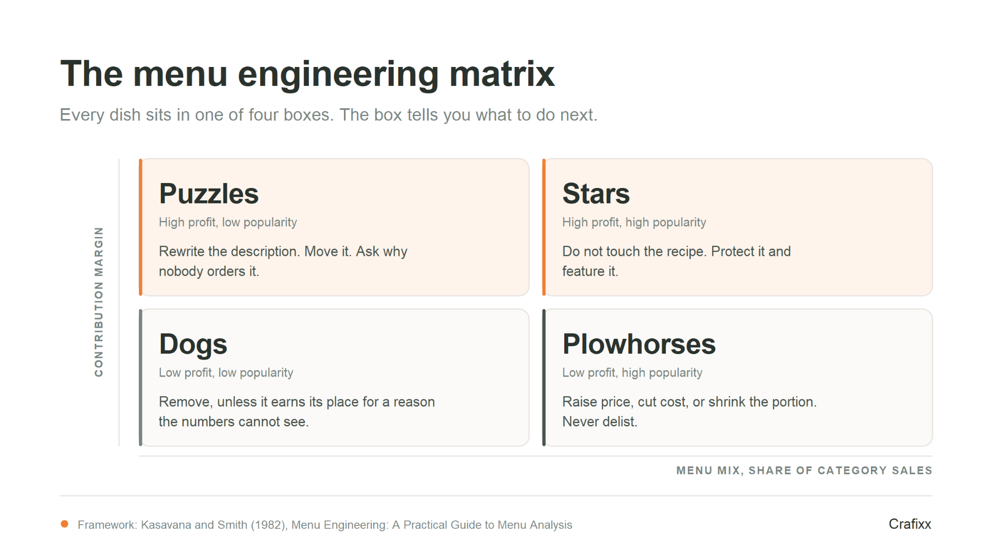
The matrix sorts every dish into one of four quadrants using two questions: does it sell well, and does it make money. Each quadrant carries a different instruction. The mistake most operators make is treating all four the same way, usually by cutting anything that is not a Star.
| Quadrant | Popularity | Profit | What to do |
|---|---|---|---|
| Stars | High | High | Protect them. Keep quality and portion consistent, hold the price, and give them the strongest position on the page. Never quietly shrink a Star. |
| Plowhorses | High | Low | Work on the cost, not the popularity. Re-engineer the recipe, renegotiate the ingredient, or raise the price in small steps. These items bring people in, so removing them is usually a mistake. |
| Puzzles | Low | High | The margin is already there, so the problem is visibility or appeal. Rename it, rewrite the description, reposition it, or have staff recommend it. This is the quadrant design can move most. |
| Dogs | Low | Low | Remove, unless the dish exists for a reason the numbers cannot see: a dietary requirement, a signature item, or a dish that anchors the perception of the rest of the menu. |
You cannot engineer a menu you have not measured. Three calculations put every dish on the matrix, and all three come from data a kitchen already has: the recipe, the supplier invoice, and the sales report.
Food cost percentage is the cost of the ingredients in a dish divided by its selling price, expressed as a percentage. A dish costing 18 to make and selling at 60 has a food cost of 30 per cent. It is the single most quoted number in hospitality and the most frequently miscalculated, because operators forget the parts of the plate nobody charges for.
Food cost percentage = (cost of ingredients / selling price) x 100
Include everything that leaves the kitchen on the plate: garnish, sauce, oil, the bread nobody ordered, and the yield loss from trimming and cooking. A recipe costed on raw purchase weight rather than usable yield will understate the true cost of every protein dish on your menu.
Contribution margin is the selling price minus the ingredient cost. It is the cash a dish actually contributes toward rent, wages and profit. This is the axis Kasavana and Smith used, and it matters because percentages can mislead in a way that cash does not.
A dish with a 25 per cent food cost that sells twice a night contributes less than a dish with a 40 per cent food cost that sells forty times. Chasing the lowest food cost percentage across the whole menu is one of the most common and most expensive errors in the discipline. Bank the cash, not the ratio.
Menu mix is the share of total sales a dish represents within its own category. Compare starters against starters and mains against mains, never a dessert against a main course. A dish is generally treated as popular when it sells above what an even split of that category would predict.
Pull at least four to eight weeks of sales data before classifying anything. A shorter window will mislabel a dish that had one good weekend, and a menu redesign built on a mislabelled dish is worse than no redesign at all.
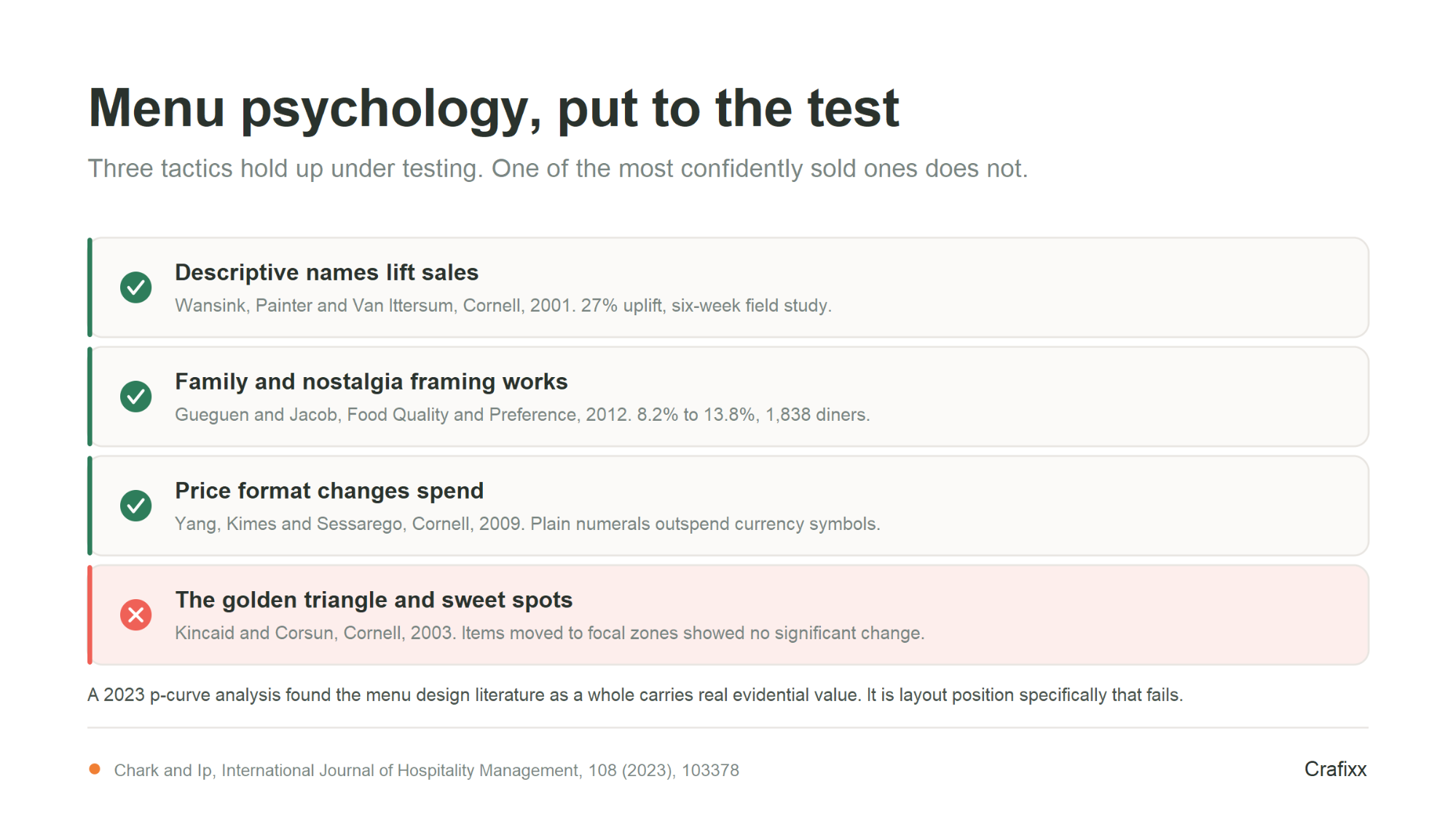
This is the section most menu engineering guides skip. Menu design carries a body of published academic research, and it does not support everything the industry repeats. Two widely quoted tactics hold up under testing. One of the most confidently repeated ones does not.
Broadly yes. A 2023 p-curve analysis of the menu design literature found both the full and half p-curves significantly right-skewed, which is the statistical signature of real effects rather than selective reporting. The result held across large and small samples, older and newer papers, hospitality and foodservice journals, US and non-US studies, lab and field settings, and mock and real menus. That is a meaningful check, because plenty of marketing research does not survive it.
So menu design does move behaviour. The useful question is not whether it works, it is which specific tactics have evidence behind them and which are simply repeated until they sound true. The rest of this section separates the two.
One caveat we will state plainly rather than bury. The single most quoted study in menu design, covered next, was led by a researcher whose later work drew retractions and a university finding of research misconduct. That specific paper has not been retracted, and its result has since been supported by independent teams. We have flagged it, and cited the independent work alongside it, because a guide that tells you to distrust the golden triangle should hold its own sources to the same standard.
Supported: descriptive names sell more
Descriptive menu labels increased sales of the labelled items by 27 per cent compared with the same items given plain names, in a six-week study by Wansink, Painter and Van Ittersum published in the Cornell Hotel and Restaurant Administration Quarterly in 2001. Customers also rated the descriptively labelled dishes as higher quality and better value.
This is the strongest single finding in menu design, and it is a writing job before it is a layout job. It is also the cheapest change on this list. Rewriting the description of a Puzzle costs nothing and targets exactly the quadrant that responds best to attention.
Guests given a menu with prices shown as plain numerals spent significantly more than guests given the same menu with a currency symbol, or with prices written out as words. That finding comes from Yang, Kimes and Sessarego, published by Cornell in 2009 and tested on real lunch checks at a working restaurant.
The practical version: set prices as 60 rather than AED 60.00, drop the trailing decimals, and never run a dotted leader line from the dish name to the price. That line invites the eye to scan a column of numbers and shop on price alone.
The descriptive-label effect has been reproduced by a team with no connection to the original lab. Gueguen and Jacob ran a field experiment across 1,838 diners in a working restaurant and tested labels evoking family, tradition and patriotism against plain ones. Plain labels took 8.2 per cent of orders. Family framing took 13.8 per cent.
Family framing beat both tradition and patriotism, and all three beat the plain label at conventional significance. Published in Food Quality and Preference in 2012.
This matters for the UAE more than for most markets. A dining room in Dubai serves people who are a long way from where they grew up, and "the way my grandmother made it" is not a marketing flourish there, it is the actual reason somebody picks that dish tonight. Naming a dish after the family or the region it comes from is doing real work, provided the claim is true. If nobody's grandmother was involved, do not say she was.
The claim that the eye lands first on a particular zone of the menu, usually described as the top right or the centre, and that moving a dish there will lift its sales, has been tested and did not hold. Kincaid and Corsun repositioned target items into the supposed focal points of a menu and measured sales before and after. They found no significant difference.
The paper is titled "Are consultants blowing smoke? An empirical test of the impact of menu layout on item sales", which tells you how the profession received it. More than two decades on, no published study has produced empirical support for menu sweet spots, which is notable given how much of the industry still sells the idea. The 2023 p-curve analysis referenced above found real evidential value in menu design research as a whole. It is layout position specifically, not menu design, that fails to survive testing.
This does not mean layout is irrelevant. It means position alone is not a lever, and any proposal that leads with a golden triangle diagram and no other substance is selling folklore. Hierarchy, clarity and how many items compete for attention matter far more than which corner a dish sits in.
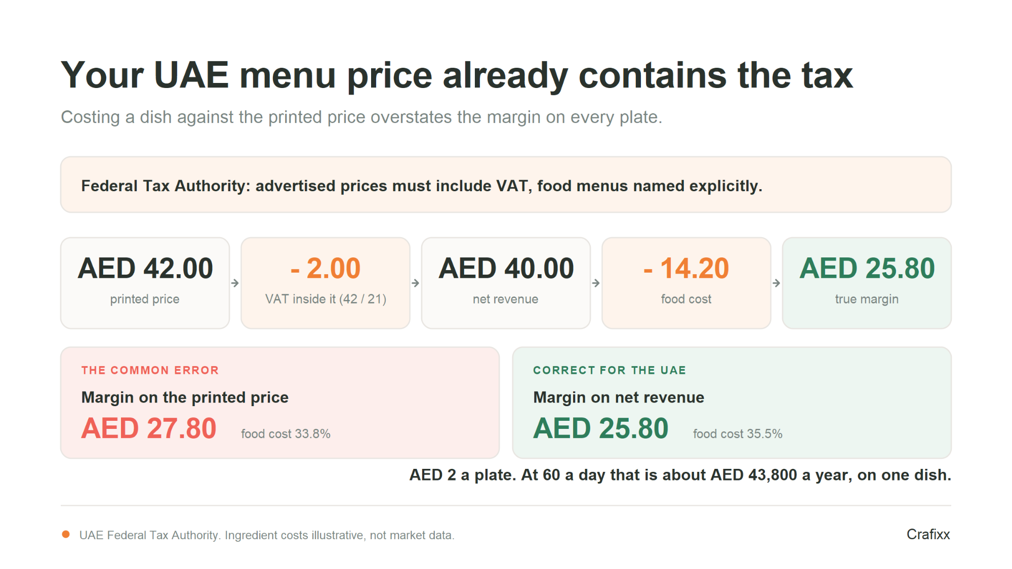
In the UAE your menu price already contains VAT, because the law requires it. So the money you actually keep from a dish is the menu price minus the tax, not the menu price. Run contribution margin on the printed number and you will overstate the margin on every plate you sell, all year.
The Federal Tax Authority is explicit: "A registrant must ensure that prices of goods and services advertised to consumers include VAT, whether in food menus, catalogues, or price tags." Menus are named in the rule. The FTA also gives the extraction method: the VAT contained in a transaction is calculated by dividing the price by 21.
Every global menu engineering guide was written for markets where tax is added at the till. Applied unchanged in the UAE, the arithmetic is wrong in your favour, which is the most dangerous direction for a costing error to run.
Take a chicken shawarma platter on the menu at AED 42. The ingredient costs below are illustrative, not market data. Substitute your own invoice prices, because that is the only version of this table that means anything.
| Line | AED |
| Menu price, as printed and VAT-inclusive | 42.00 |
| Less VAT contained in the price (42 divided by 21) | 2.00 |
| Net revenue you actually keep | 40.00 |
| 180g marinated chicken thigh | 6.30 |
| Two Arabic breads | 1.10 |
| Garlic sauce, 40g | 1.40 |
| Pickles and salad | 1.80 |
| Fries, 150g | 2.10 |
| Delivery packaging | 1.50 |
| Total food cost | 14.20 |
| Metric | On the printed price (wrong) | On net revenue (correct) |
| Food cost percentage | 33.8% | 35.5% |
| Contribution margin | AED 27.80 | AED 25.80 |
Two dirhams a plate. It looks like rounding error until you multiply it. Sell sixty of them a day and the gap is AED 120 daily, roughly AED 43,800 across a year, on one dish. Do the same thing across a forty-item menu and you have built your entire pricing strategy on money that was never yours.
The fix takes one column in your spreadsheet. Divide every menu price by 21, subtract that from the price, and cost everything against what is left. Then set your target food cost percentage against the net figure too, because a 30 per cent target measured on the gross price is really about 31.5 per cent measured properly.
One caution before you generalise this. Venues operating inside hotel establishments carry additional charges beyond VAT, and what applies depends on your licence and emirate. Confirm your own position with your accountant rather than assuming the standalone case covers you.
The research on dropping the currency symbol still applies, and the VAT rule does not conflict with it. Printing 42 rather than AED 42.00 is a formatting choice about how the guest reads the number. The tax is inside the 42 either way. What you must not do is print a price and then add tax at the till, which is both against the rule and the fastest way to lose a table's goodwill at the worst possible moment.
If position is weaker than claimed, what does design contribute? Attention management. A menu is a document a guest reads under time pressure, often in poor light, often while talking. Every design decision either reduces or increases the effort of choosing, and effort is what pushes people toward the safe, familiar, usually lower margin option.
A section with twenty dishes does not give guests more choice, it gives them more work. When choosing becomes hard, people default to what they already know, which is rarely the dish you want to sell. Cutting a bloated section is usually the highest impact structural change available, and it also cuts prep, waste and stockholding.
Boxes, tints, icons and bold type work by contrast. Emphasise one dish in a section and it stands out. Emphasise five and the section simply looks busy, with nothing standing out at all. Most menus that have been edited repeatedly over the years fail here, because each revision added an emphasis and none removed one.
Menus are read in dim rooms by guests across a wide age range. Type that looks elegant on a designer's screen can be unreadable at the table. Set body text large enough to read at arm's length in low light, keep line lengths short enough to scan, and give each dish enough space that the name, the description and the price read as one unit rather than three competing ones.
Reserve decorative type for section headings and the restaurant name. Anything a guest has to decode is friction, and friction sends people back to the dish they ordered last time.
Seasonal and calendar cycles
Menus that change for a season, a holiday period or a special calendar need a structure that can absorb an insert or a swapped section without the whole document being redesigned. Build that flexibility in from the first version.
A high priced item at the top of a section changes how every price beneath it reads. This is a well established effect in pricing generally, though it is worth being honest that the menu specific evidence is thinner than the descriptive labelling evidence. Use it, but do not build the whole strategy on it, and do not let an anchor item look absurd next to the rest of the section.
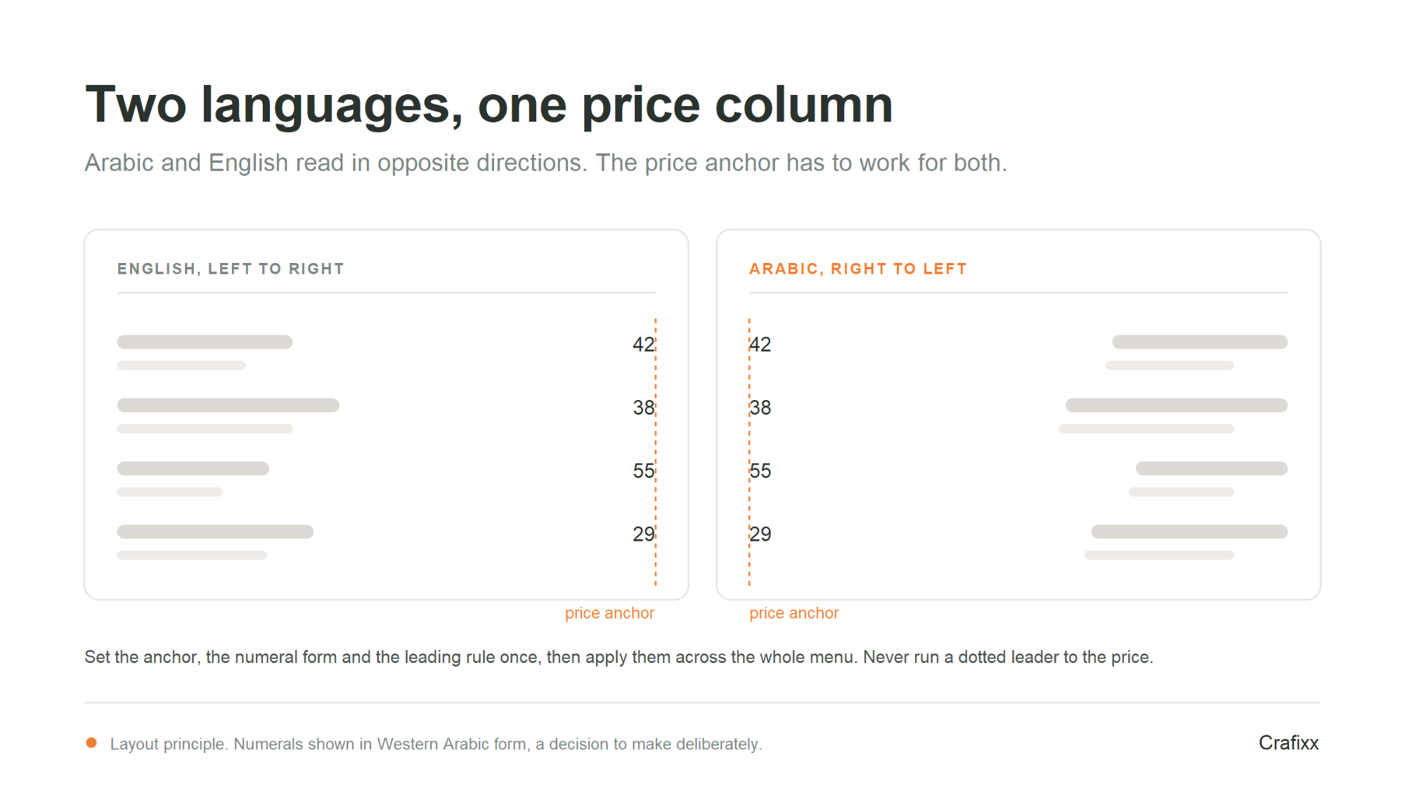
A bilingual menu is not a translated menu. Arabic reads right to left and English reads left to right, so the two languages pull the page in opposite directions, and a layout that works for one will usually break the other. This is a structural design problem, and it is the part of menu work most often handled last and worst.
There are three workable structures: two separate menus, one menu with mirrored facing pages, or a single page carrying both languages per dish. The third is the most common and the hardest to get right, because each dish now needs two names, two descriptions and one shared price, all balanced without either language looking like an afterthought.
Arabic and Latin scripts do not share the same visual weight at the same point size. Arabic type usually needs a larger optical size to sit comfortably beside Latin type, and the two typefaces have to be chosen as a pair rather than picked separately. A mismatched pairing reads as one language being the real menu and the other being a translation.
The same description will run to different lengths in each language, so a rigid two column grid will leave ragged gaps. Prices need a single, consistent anchor point that works in both reading directions, and numerals need a deliberate decision, since the two languages can use different numeral forms. Settle these rules once and apply them across the whole menu.
There is a commercial point in this too. Whichever language sits second in the hierarchy will be read as the secondary menu. If half your room reads Arabic first, a layout that treats Arabic as an afterthought is quietly discounting half your guests.
The matrix and the maths travel anywhere. The trading conditions do not. A menu in Dubai is read by a room of people from dozens of countries, is often ordered from a phone rather than a table, changes shape during Ramadan, and may or may not carry a drinks list depending on the licence. Each of those changes what the menu has to do.
A cafeteria doing karak and paratha, a Kerala restaurant in Karama, a Filipino kitchen, a specialty coffee roaster, a Japanese counter, a modern Emirati kitchen and a hotel brunch are seven different businesses that happen to share a category label. Run the matrix separately for each daypart and each cuisine section. A dish that is a Plowhorse at Friday brunch can be a Star on a Tuesday lunch, and averaging the two tells you to fix something that is not broken.
Aggregator ordering is a normal way to eat in the UAE, not an overflow channel, and it changes the economics of every dish. Commission comes off the top, packaging comes off the margin, and the dish has to survive a journey. A plate whose contribution margin works in the dining room can be a loss on delivery once you add the box, the sauce pot and the commission.
Cost your delivery menu as its own exercise. Some Stars do not travel and should be dining-room only. Some Puzzles that nobody orders while looking at a printed menu become obvious on a phone screen where the photograph does the selling.
Iftar and suhoor trading changes volume, timing and party size, usually toward set menus and sharing formats. That is a genuine opportunity to move Puzzles, because a set menu lets you place a high-margin dish in front of a guest who did not have to choose it. Build the Ramadan menu from your matrix rather than repeating last year's, and re-run the numbers afterwards, because the data from that period will distort your annual averages if you leave it mixed in.
Beverages carry the strongest margins in hospitality. A venue without a drinks licence has to recover that from food and from non-alcoholic beverages, which raises the stakes on the food matrix considerably. If that is your situation, the mocktail, fresh juice and specialty coffee sections deserve the same costing rigour you give the mains, because they are doing the job the bar does elsewhere.
Getting the costing right and then handing it to a layout that undoes the work is the most common way this exercise fails. If you want the analysis and the printed result handled as one job, that is what our restaurant menu design work in Dubai is for.
Menu engineering is a repeatable process, not a one off project. Run it end to end and you will have a defensible menu rather than a redesigned one.
These are two different jobs and conflating them wastes money. Re-engineering changes which dishes are on the menu and how they are described and priced. Redesigning changes how the menu looks, reads and is produced. You can do either without the other, and knowing which one you need is most of the decision.
| Situation | What you need |
|---|---|
| Margins are slipping but guests are happy | Re-engineer. The problem is costing and mix, not appearance. |
| Guests keep ordering the same three dishes | Re-engineer, then redesign. Descriptions and emphasis are doing nothing. |
| The menu has been patched repeatedly and looks it | Redesign. Accumulated edits destroy hierarchy. |
| Brand or identity has changed | Redesign, as part of the wider identity work. |
| Launching a new venue | Both, in that order. Engineer the mix, then design the document. |
Crafixx works on the design half of this. We design menus, brand identities and the printed and digital collateral around them, and the sections above describe how we approach that work. The costing and sales analysis is the operator's side of the table, and a good menu project needs both. If you want to talk about the design side, our menu design services sit within our wider graphic design work, alongside corporate identity design.
Ask Us Anything!
Menu engineering is the practice of classifying every dish by popularity and profit contribution, then using pricing, naming and design to shift sales toward the most profitable items. It was formalised by Kasavana and Smith at Michigan State University in 1982.
Review the numbers quarterly and act on them at least twice a year. Ingredient costs, supplier prices and guest preferences all move, so a classification that was correct twelve months ago is unlikely to still be correct now.
Four to eight weeks of item level sales as a minimum. Less than that and seasonal swings, a single busy weekend or one promotional period will distort the classification and send you into a redesign based on the wrong dishes.
The published evidence says no. Kincaid and Corsun repositioned dishes into the supposed focal zones and found no significant change in sales. Layout still matters, but through hierarchy, item count and clarity rather than through position alone.
Yes. The Federal Tax Authority requires that prices advertised to consumers include VAT, and it names food menus specifically. That means the printed price already contains the tax, so your contribution margin must be calculated on the price minus the VAT it contains, not on the printed figure.
Divide the price by 21. That is the method the Federal Tax Authority gives for extracting the VAT contained in a transaction. A dish printed at AED 42 contains AED 2 of VAT, leaving AED 40 of net revenue. Cost the dish against the 40.
Yes. Commission and packaging come out of the same margin, and not every dish survives the journey. A dish that is profitable in the dining room can lose money on delivery once those costs are in. Treat the delivery menu as its own matrix with its own costings.
Rewriting the descriptions of the profitable dishes that are not selling. Descriptive labels increased sales of those items by 27 per cent in the Cornell study by Wansink, Painter and Van Ittersum, and rewriting costs nothing but time.
The Cornell research by Yang, Kimes and Sessarego found guests spent significantly more when prices appeared as plain numerals rather than with a currency symbol or written out. Check any local requirement on price display first, then simplify as far as that allows.
We use cookies to help you navigate efficiently and perform certain functions. You will find detailed information about all cookies under each consent category below.
The cookies that are categorised as "Necessary" are stored on your browser as they are essential for enabling the basic functionalities of the site.
We also use third-party cookies that help us analyse how you use this website, store your preferences, and provide the content and advertisements that are relevant to you. These cookies will only be stored in your browser with your prior consent.
You can choose to enable or disable some or all of these cookies but disabling some of them may affect your browsing experience.