
Aqua Bridge Holding Case Study
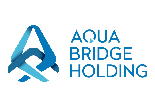
Aqua Bridge Holding approached Crafixx with a common but critical branding challenge: as a diversified holding company, they needed a corporate logo design that could represent multiple business verticals under one unified identity, without looking generic or losing meaning.
- Logo Design
- Brand Identity Design
- Corporate Branding
- Visual Identity Guidelines
- Logo Ideation & Concept Development
Aqua Bridge Holding needed more than a symbol — they needed a brand identity system that told the story of connection, movement, and depth. As a Dubai-based holding entity, the logo had to reflect the international, multi-sector nature of the business while still feeling rooted in the region's identity as a global trade and investment hub.
Crafixx was engaged to design a custom logo and visual identity that merged two core concepts — water (fluidity, adaptability, growth) and bridges (connection, structure, trust) — into a single, memorable brand mark suitable for a holding company operating across multiple industries.
Aqua Bridge Holding approached Crafixx with a common but critical branding challenge: as a diversified holding company, they needed a corporate logo design that could represent multiple business verticals under one unified identity, without looking generic or losing meaning.
Their core requirements included:
- A brand mark that communicated trust, stability, and fluidity — values essential for a holding company managing diverse assets
- A visual identity flexible enough to sit across finance, real estate, and trading subsidiaries
- Differentiation from the sea of generic "bridge" and "water" themed logos common in the region
- A modern, scalable mark that performs well digitally (favicons, app icons, social profiles) as well as in print and signage
- A name-driven concept — "Aqua" (water) and "Bridge" (connection) — that needed literal and abstract representation without becoming a cliché
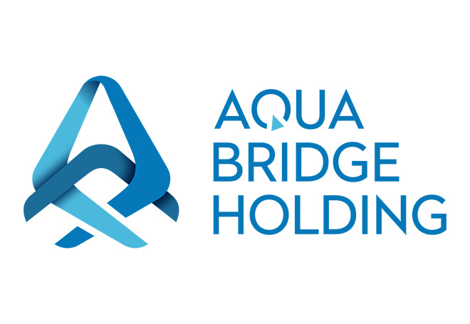
Crafixx's design team developed a layered ribbon-style emblem that visually interprets both halves of the brand name simultaneously:
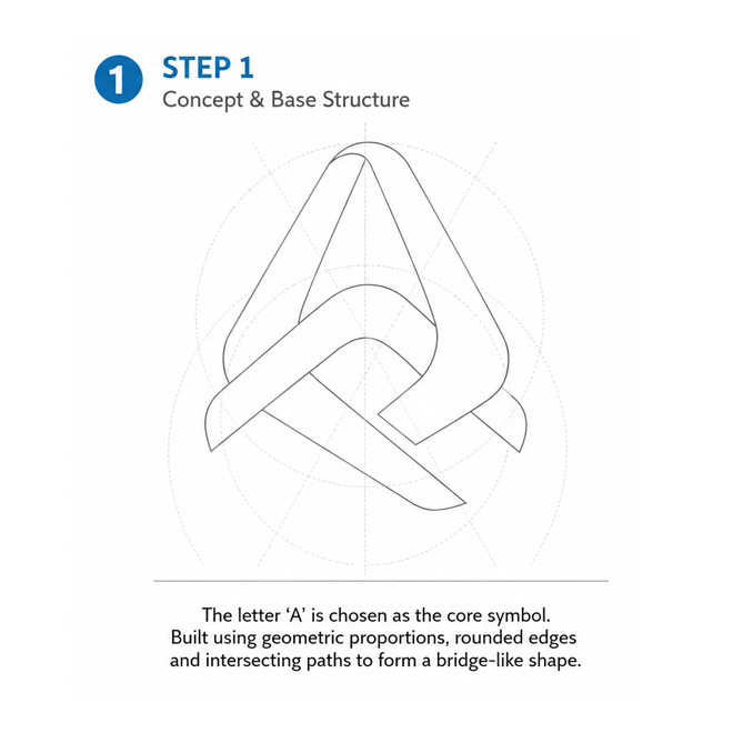
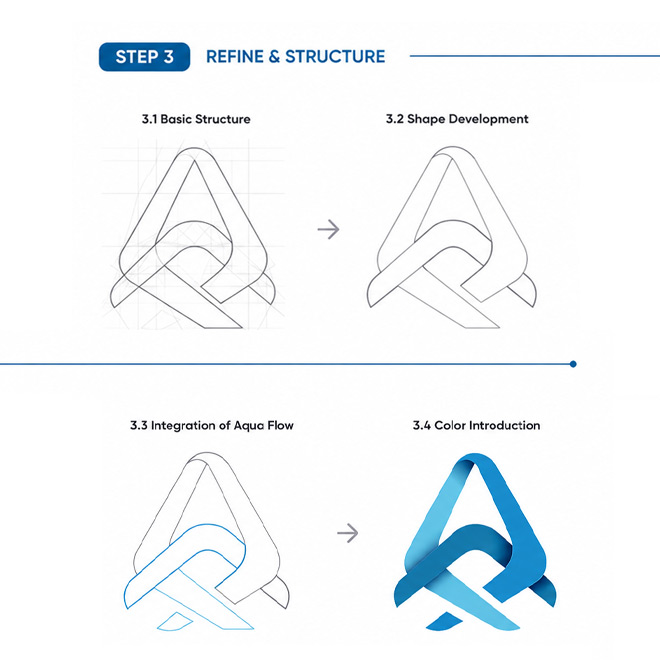
- The "A" formation — Two intertwined ribbon strokes fold into an abstract letterform resembling an "A" (for Aqua), doubling as a bridge silhouette when viewed as a whole
- Dual-tone gradient in blue — A deep navy-to-sky-blue gradient palette reinforces water, depth, and trust — colors widely associated with reliability in financial and holding-sector branding
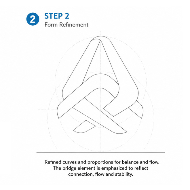
- The interlocking arc — A crossing wave-like arc through the center of the mark represents connectivity between sectors, echoing the "bridge" concept and symbolizing the company's role in linking opportunities across markets
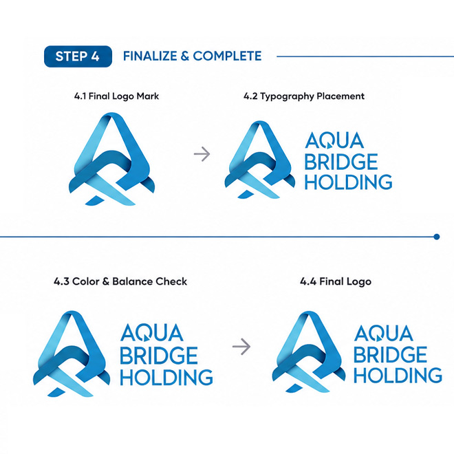
- Modern sans-serif wordmark — A clean, geometric sans-serif typeface for "Aqua Bridge Holding" paired beside the icon ensures readability and a premium, corporate feel across digital and print applications
- Scalable icon-only mark — The ribbon symbol was designed to work independently as a favicon, app icon, and social media avatar, ensuring brand consistency across every digital touchpoint
- Discovery & Brand Brief — Stakeholder interviews to understand Aqua Bridge Holding's business verticals, target investors, and long-term brand positioning goals
- Market & Competitor Research — Benchmarking against holding companies and financial groups across the UAE and GCC region to identify whitespace for differentiation
- Concept Sketching — Multiple ideation rounds exploring literal (bridge structures, water droplets) and abstract (ribbon, wave, monogram) directions
- Digital Concept Development — Vector-based refinement of the top-performing concept using Adobe Illustrator, testing scalability at multiple sizes
- Client Feedback & Iteration — Two structured revision rounds based on client input on color depth, ribbon proportions, and wordmark pairing
- Finalization & Guidelines — Delivery of final logo files (AI, EPS, SVG, PNG, PDF) along with a brand usage guideline covering clear space, minimum sizing, color codes, and incorrect usage examples
Result
The final identity gave Aqua Bridge Holding a distinctive, ownable brand mark that stands apart from typical financial and holding-sector logos in the market. Key outcomes included:
- A memorable, story-driven brand mark that visually communicates the company's dual identity — fluid like water, structured like a bridge
- A fully scalable identity system ready for use across business cards, investor decks, signage, digital platforms, and subsidiary co-branding
- Positive stakeholder reception for a logo that felt premium, modern, and distinct compared to competitor holding companies in Dubai and the wider GCC
- A cohesive visual foundation that can extend across future sub-brands and business verticals as Aqua Bridge Holding expands
For another mark built to avoid its sector's usual clichés, see our Avid Marine case study.