
Avid Marine Case Study
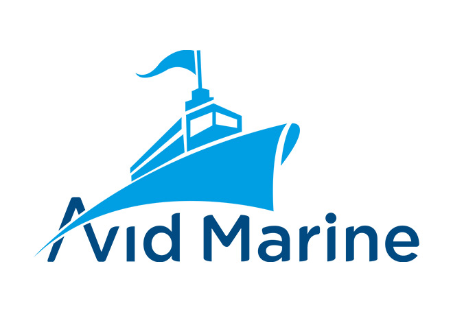
Avid Marine, a maritime and marine services company, came to Crafixx needing a logo design that could instantly communicate industry relevance without falling back on the overused anchor-and-rope visual cliché found across most marine logo design portfolios.
- Logo Design
- Brand Identity Design
- Maritime Branding
- Icon & Wordmark Development
- Brand Usage Guidelines
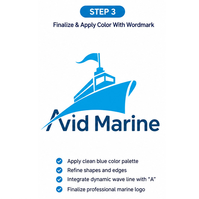
Avid Marine needed a brand identity that positioned them as a forward-moving, energetic player in the marine services space — not another traditional shipping-company logo. Crafixx was brought in to design a custom maritime logo that fused a recognizable ship silhouette with the brand's name in a single, cohesive composition, giving the identity both industry context and strong visual distinction.
The goal was to design a mark that could work as a standalone icon for digital platforms and merchandise, while also flowing naturally into a full wordmark lockup for formal branding use — all while keeping the maritime association immediate and unmistakable.
Avid Marine, a maritime and marine services company, came to Crafixx needing a logo design that could instantly communicate industry relevance without falling back on the overused anchor-and-rope visual cliché found across most marine logo design portfolios. Their key challenges were:
- Standing out in a crowded maritime and shipping sector where most competitors use near-identical ship, anchor, or wave iconography
- Needing a mark that reflected speed, confidence, and forward motion — reinforcing the "Avid" (eager, enthusiastic) brand personality alongside the marine industry focus
- Ensuring the logo worked as both a strong standalone icon (for app icons, vessel signage, uniforms) and a full lockup with wordmark for official documents and digital platforms
- A visual identity that felt modern and dynamic rather than traditional or "nautical-vintage," a common trap in shipping company branding
- Clear legibility of the wordmark at small sizes for use across business cards, email signatures, and mobile app icons
Crafixx's design team crafted an integrated ship-and-letterform logo that merges the brand name directly into the vessel's silhouette:
- Ship bow doubling as the letter "A" — The sweeping curve of a ship's hull and bow forms the negative space of the letter "A" in "Avid," creating an instantly recognizable dual-meaning mark
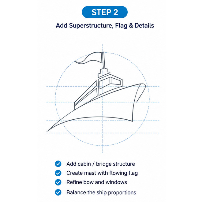
- Command tower & signal flag detail — A stylized ship's bridge/control tower topped with a flag adds authenticity and a sense of authority and navigation, reinforcing trust in maritime operations
- Dynamic sky-blue gradient — A vivid cyan-to-blue palette was chosen over traditional navy-only maritime branding to convey energy, motion, and a modern, "avid" (eager/enthusiastic) brand personality
- Bold geometric wordmark — "Avid Marine" is set in a rounded, confident sans-serif in deep navy, ensuring strong contrast and legibility against the lighter icon above it
- Icon-first scalability — The ship-and-flag mark was engineered to function independently as a favicon, app icon, and social avatar without losing recognizability at small sizes
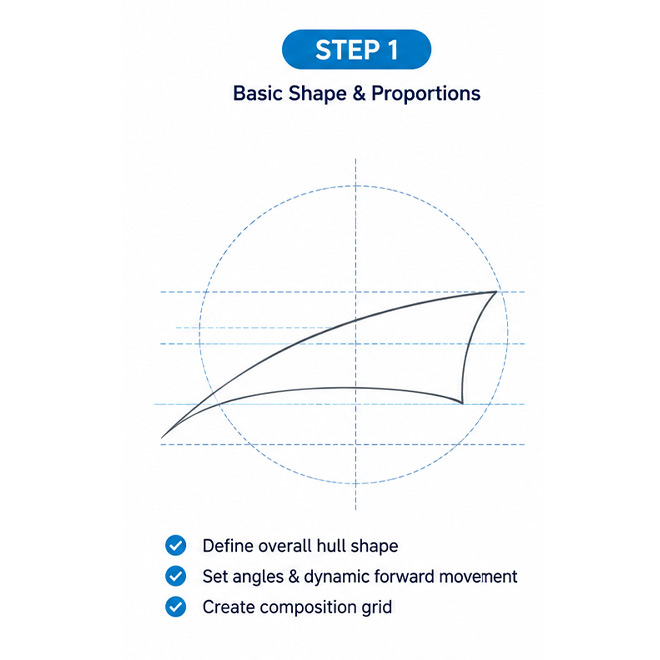
- Discovery & Brand Brief — Sessions with Avid Marine stakeholders to understand fleet operations, target clientele, and desired brand tone (energetic vs. traditional maritime)
- Competitor & Industry Research — Analysis of maritime, shipping, and marine services logos across the UAE and international markets to identify differentiation opportunities
- Concept Sketching — Multiple directions explored, including anchor-based, wave-based, and ship-silhouette concepts, before converging on the integrated "A-as-bow" approach
- Vector Development & Testing — Digital refinement in Adobe Illustrator, stress-testing the icon at favicon size, embroidery scale, and large-format signage
- Client Feedback & Revisions — Two rounds of structured revisions refining flag placement, gradient depth, and wordmark spacing
- Final Delivery & Brand Guidelines — Delivery of complete logo suite (AI, EPS, SVG, PNG, PDF) with a brand guideline document covering clear space, minimum sizing, and correct/incorrect usage
Result
The final Avid Marine identity delivered a distinctive, energetic brand mark that breaks away from generic maritime branding conventions. Key outcomes included:
- A highly recognizable dual-meaning icon (ship bow + letter "A") that gives Avid Marine an ownable visual signature in the marine services sector
- A flexible identity system ready for use across vessels, uniforms, digital platforms, business documentation, and signage
- Strong internal and client stakeholder approval for a brand mark that felt modern, energetic, and industry-credible — avoiding the dated "anchor-and-rope" aesthetic common among competitors
- A scalable icon-only mark that performs cleanly across favicons, app icons, and merchandise without loss of detail