
Al-Furat Case Study
(Discovery to Final Delivery)
Established in 2014, Al-Furat Scientific Bureau is a medical and pharmaceutical distributor, or scientific bureau, based in Iraq.
- Pharmaceutical Packaging Design
- Arabic–English Packaging
- RTL Design Implementation
- Packaging Redesign
- Visual Communication
Creating a Unified Packaging Language for Two Pharmaceutical Products
Crafixx developed packaging solutions for two products from Al-Furat Scientific Bureau:
- Levonorgestrel
- Norethisterone
The project required a careful balance between pharmaceutical communication and contemporary visual design.
The packaging needed to accommodate Arabic and English information while maintaining consistency across both products.
Crafixx therefore created a design approach where:
- Product information remained clear.
- Arabic became a natural part of the visual hierarchy.
- English remained structurally aligned.
- RTL functionality was properly implemented.
- The overall packaging gained a stronger visual identity.
The goal was simple:
Make the packaging easier to understand, easier to navigate and stronger to look at.
When Pharmaceutical Packaging Communicates, Design Matters.
Established in 2014, Al-Furat Scientific Bureau is a medical and pharmaceutical distributor, or scientific bureau, based in Iraq.
The existing packaging for its pharmaceutical products lacked the visual appeal and design refinement needed to create a strong, professional product presence.
The challenge went beyond aesthetics.
The packaging needed to communicate essential pharmaceutical information clearly in both Arabic and English, while ensuring that Arabic was presented in a genuinely right-to-left (RTL) structure.
The existing English-oriented structure did not naturally accommodate Arabic.
This created three key challenges:
- Limited visual appeal that reduced the packaging's shelf presence.
- Arabic content that needed to be integrated more naturally rather than simply translated.
- An English-based layout that required proper RTL implementation for an authentic Arabic reading experience.
For pharmaceutical packaging, where clarity and credibility are critical, the opportunity was to create a design that was visually stronger, structurally clearer and culturally appropriate.
Reimagining the Packaging Around Clarity, Credibility and Arabic-First Design
Crafixx approached the project as more than a packaging facelift. We redesigned the visual communication system while retaining the essential information structure required for pharmaceutical products.
The solution focused on three core principles:
- Stronger Visual Appeal
We introduced a cleaner, more contemporary packaging direction designed to give the products greater visual presence. The objective was not to make pharmaceutical packaging decorative, but to make it professional, recognisable and visually engaging. - Arabic Designed — Not Simply Translated
Arabic content was carefully integrated into the packaging rather than being treated as an afterthought. Typography, spacing, hierarchy and positioning were adapted to ensure that Arabic remained visually balanced alongside English. - True RTL Implementation
The English structure was reworked to function naturally in a right-to-left environment.
Rather than simply flipping the artwork, Crafixx reconsidered the hierarchy and positioning of design elements so the Arabic version followed a natural reading flow.
The result was bilingual packaging that looked designed for its audience—not translated for it.
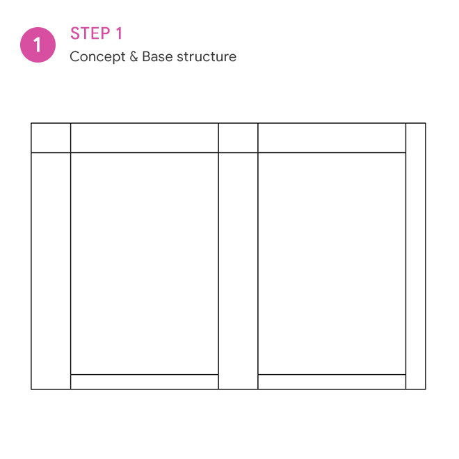
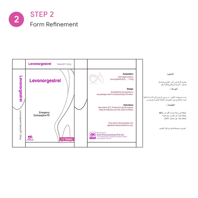
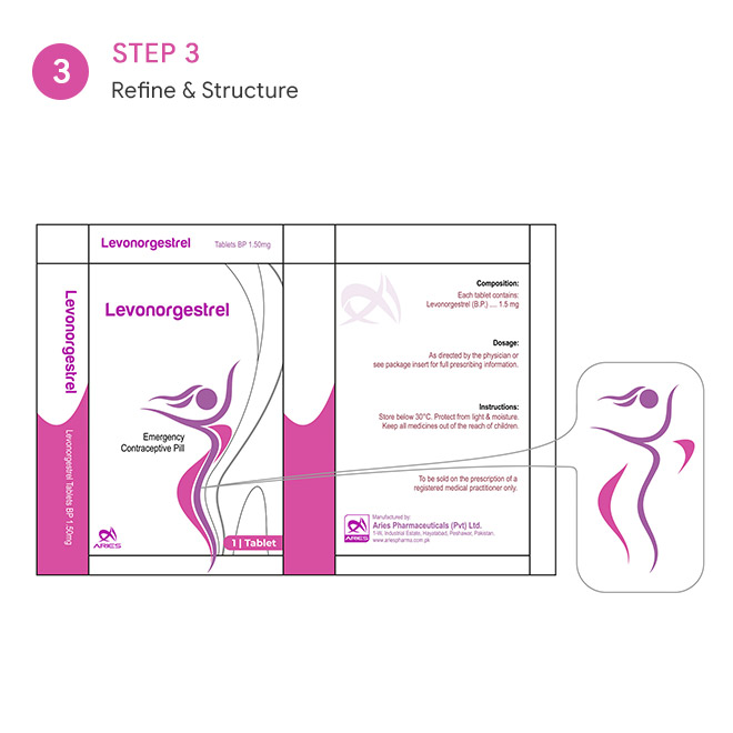
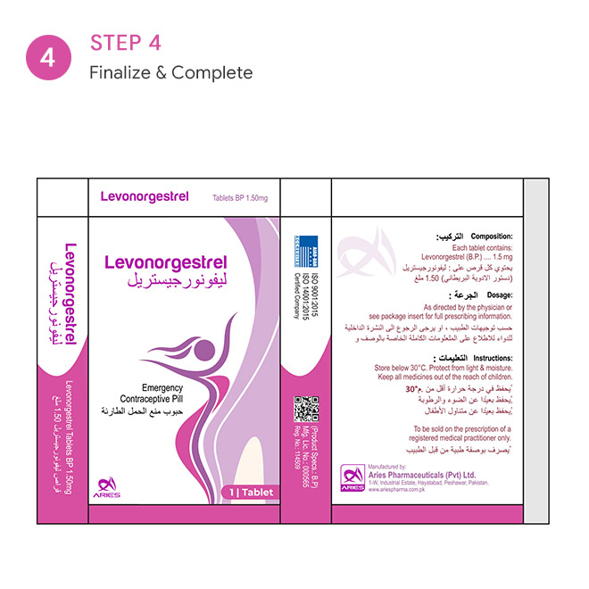
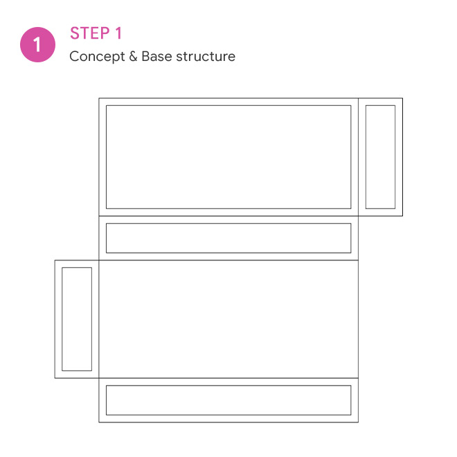
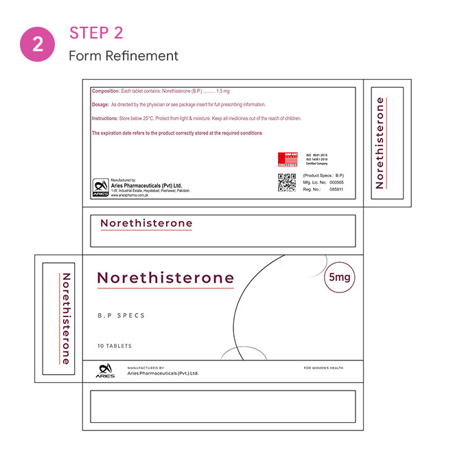
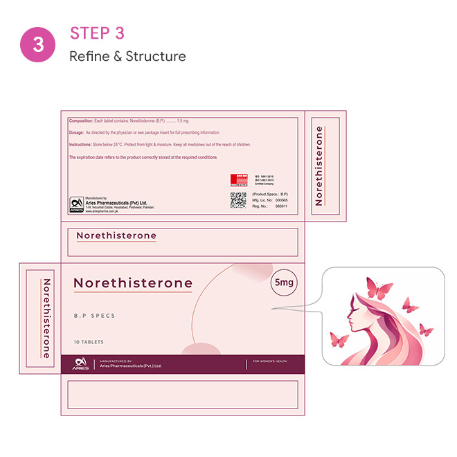
From Existing Structure to Market-Ready Packaging
- Understanding the Existing Packaging
We began by examining the existing artwork and identifying areas where the packaging lacked visual impact, hierarchy and bilingual balance. We analysed the English structure, information placement and overall composition before developing the new direction. - Defining the Visual Direction
The next step was to establish a cleaner and more professional visual language appropriate for pharmaceutical products. Every design decision was made with one question in mind:
Can this information be understood quickly and confidently? - Arabic Integration
Arabic content was incorporated into the design with careful attention to typography, spacing and hierarchy. Instead of placing Arabic into an English template, we adapted the composition around the requirements of Arabic. - RTL Implementation
The layout was structurally adapted for right-to-left reading. Elements were repositioned and realigned where required so the Arabic experience felt intentional and natural. - Bilingual Balancing
Arabic and English were brought together within a single cohesive system. The objective was to avoid the common problem of one language appearing dominant while the other feels secondary. - Product Adaptation
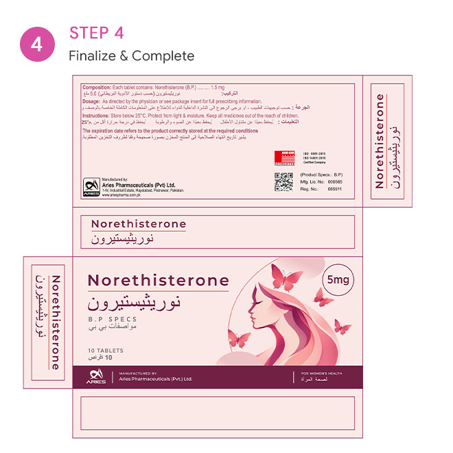
The established design system was then applied across the Levonorgestrel and Norethisterone packaging, maintaining consistency while allowing each product to retain its own identity. - Final Artwork
The final packaging artwork was refined for consistency, readability and professional presentation, creating a unified packaging system for the client's pharmaceutical portfolio.
Result
From Functional Packaging to a Stronger Product Presence
Crafixx transformed the packaging direction for Al-Furat Scientific Bureau from a visually weak, English-structured format into a more contemporary bilingual packaging experience.
The redesigned approach delivered:
- Stronger visual appeal
A cleaner and more professional product presentation. - Improved Arabic integration
Arabic content became an integral part of the design rather than an added translation layer. - Proper RTL implementation
The layout was adapted to support natural Arabic right-to-left reading. - Better bilingual hierarchy
Arabic and English were balanced within one cohesive visual system. - Consistency across products
The same design thinking could be carried across Levonorgestrel and Norethisterone. - A more credible pharmaceutical presence
The packaging was designed to better reflect the professionalism of an established medical and pharmaceutical distributor.